New visual profile
Together with Tank Design Tromsø, the Norwegian Centre for E-health Research have developed a new and fresh visual profile. The logo is the centre of attention - a strong and playful E - that symbolises the purpose of the centre: gather, produce and disseminate knowledge on e-health.
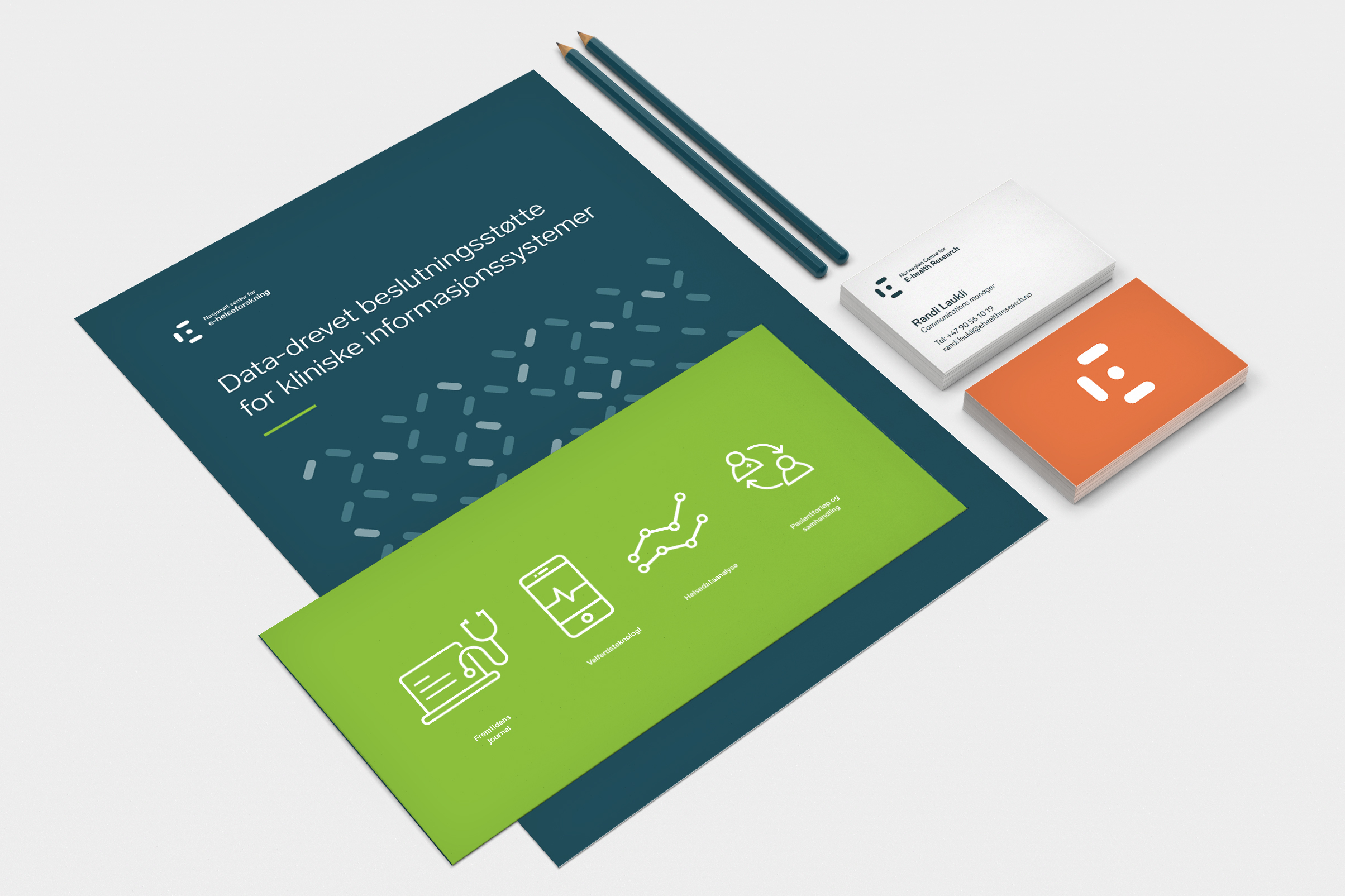
- We believe Tank Design Tromsø did a great job. Something very simple (like the letter E) becomes very meaningful. The new graphic identity will show on all material we produce: business cards, reports and our new web pages, says Centre Director Stein Olav Skrøvseth.
E-health competences
- The Norwegian Centre for E-health Research has an important knowlegde on e-health that deserves to be visualised and have greater visual power and self esteem. We wanted to create a flexible profile that shows the central position of the centre in the development of the health and care sector. New technologies and communication are key words that have meant alot in the process, while we also wanted the profile to be playful and friendly to express the openess and cooperation that the centre is looking for, says Thea Apeland Moen, graphic designer Tank Design Tromsø.